Auf den ersten Blick, sehen die Bilder von Susanne Jung einfach aus, direkt. Ein Quadrat in einer Farbe, ein Rechteck in einer anderen. Einige horizontale Streifen, die übereinander liegen. Sanfte Farben. Klare Linien und Kanten. Es gibt nichts Verstecktes, alles ist für uns sichtbar und verständlich.
Vor 60 Jahren hätte Clement Greenberg - der sehr einflussreiche amerikanische Kritiker - die Bilder als "flat" bezeichnet. Greenberg definierte den Modernismus als selbstkritisch. Das bedeutet, dass jede moderne Disziplin ihre eigenen Begriffe definieren musste, auch die Kunst und die Malerei. Die Malerei musste zeigen, was sie einzigartig machte, was nur ihr selbst eigen war. Für Greenberg war dies die flache Oberfläche, die Form des Holzes oder der Leinwand und die Eigenschaften des Pigments. All dies waren die Aspekte der Malerei, die die alten Meister in ihren illusionistischen Werken zu verbergen suchten. Im Gegensatz dazu bezeichnete Greenberg die gesamte Malerei der Moderne seit Manet als “frank” oder auf Deutsch "offen". Sie versteckten nicht die Oberflächen, auf denen sie gemalt wurden - das Auge hatte keinen Zweifel daran, dass die verwendeten Farben aus echten Töpfen oder Tuben stammten. Susanne Jungs Werk ist modernistisch in diesem offenen Sinne.
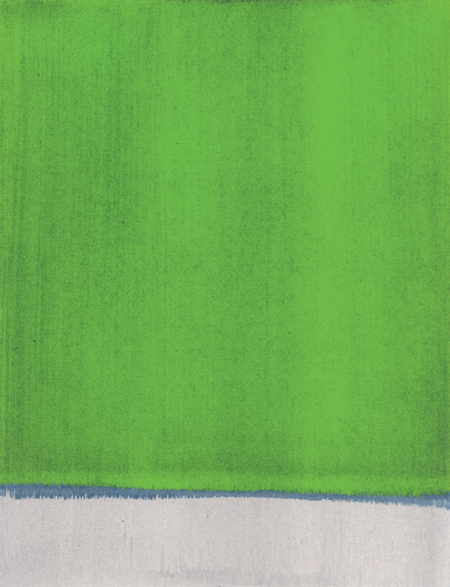
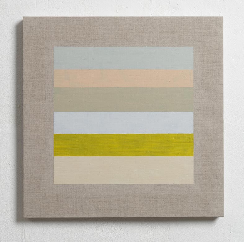
Ich weiß nicht, wie es euch scheint, aber für mich sind die Bilder hier nicht "flat". Je länger ich sie betrachte, desto mehr Tiefe steckt in dem, was auf den ersten Blick wie eine einfache quadratische Form aussieht, umgeben von einem kontrastreichen Rahmen. Alle Bilder von Susanne Jungs sind sehr sorgfältig konstruiert. Außerdem sind sie je nach verwendetem Medium unterschiedlich konstruiert. Die Ölgemälde bestehen in der Regel aus einer Reihe horizontaler Streifen, die zu einem Quadrat gruppiert sind. Die Farben sind sorgfältig ausgewählt und werden vorgemischt aufgetragen. Gelegentlich verwendet die Künstlerin mehrere Glasuren, um den richtigen Farbton zu erreichen, was dem Werk seine Lebendigkeit, Kohärenz und Tiefe verleiht. Ich finde die Acrylbilder besonders interessant. Auf einer Seite, sind sie auf Holz gemalt. Dieser Malgrund ist dick und fest. Auf der anderen Seite sind die Kanten der Bilder abgeschrägt - 45 Grad geschnitten - was den Gemälden eine Leichtigkeit verleiht, als ob sie über der Wand schweben würden. Ähnlich scheint das Quadrat in der Mitte über dem Untergrund zu schwimmen. Was wie ein von einem Rahmen umgebenes Quadrat aussehen mag, besteht aus einer Reihe sehr dünner Schichten auf einer Grundfarbe. Die vielen Schichten der Malerei ziehen den Blick an. Wir betrachten das Werk von außen nach innen. Doch statt sich selbst im Rahmen zu sehen, wie in einem Spiegel, sehen wir nur die Oberfläche, die völlig matt ist.

In unserer westlichen Kultur neigen wir dazu, alle Gemälde, einschließlich der von Greenberg beschriebenen abstrakten Werke der Moderne, als Porträts oder Spiegel zu betrachten. Sie sind Fenster zu einer anderen Welt, und wir können gelegentlich unser Spiegelbild im Glas sehen. Wir erwarten fast, dass wir ein Gesicht sehen, das zurückschaut. Aus diesem Grund malten viele modernistische Künstler wie Jackson Pollock nicht vertikal an der Wand, sondern horizontal auf dem Boden. Wie ein anderer amerikanischer Kritiker, Harold Rosenberg, anmerkt, wurde die Leinwand in der modernistischen Malerei zu einer Arena, in der man agieren konnte. Während Pollock seine Leinwand noch an die Wand heftete, bevor er seine Entscheidungen über ein Bild traf, brach das spätere postmoderne Werk mit dieser Beziehung zur vertikalen, aufrechten menschlichen Haltung. Wir haben uns daran gewöhnt, die Malerei als "horizontal flatbed" zu betrachten, auf dem, ähnlich wie bei Apps auf einem iPhone oder iPad, verschiedene Objekte angeordnet werden können.
Susanne Jung verwendet in ihrer Arbeit sowohl den vertikalen als auch den horizontalen Ansatz. Wir betrachten ihre langen Arbeiten auf Holz, während wir durch den Raum gehen. Die Linien ziehen an uns vorbei wie die Bäume, die man von einem Zug aus sieht. Andere Arbeiten, bei denen sie ein quadratisches Stück Seide aufklebt, bevor sie es mit Farbe bedeckt, wirken eher wie ein horizontales Flachbett, ein Bildschirm, auf dem sich die Dinge abspielen. Aber am interessantesten finde ich, dass sie ihre Arbeit als "Körper" bezeichnet. Ein Körper ist nicht wie ein Gesicht. Wenn wir ein Gesicht anschauen, schaut es uns zurück, und wir sehen uns gegenseitig. Einen Körper sehen wir anders an - oder vielleicht sehen wir ihn gar nicht an. Wir begegnen einem Körper - und stoßen vielleicht sogar mit einem Körper zusammen. Ein Körper hat Einfluss auf uns, aber wir können nicht sicher sein, dass wir Einfluss auf ihn haben.
Ein Körper - wie die Körper in Susanne Jungs Bildern - hat eine Materialität, eine physische Präsenz. Er ist auch ein bisschen fremd, ungewohnt. Auch hier finde ich es wichtig, dass einer der größten Einflüsse von Susanne Jung die Wandmalereien in buddhistischen Höhlentempeln entlang der Seidenstraße in China sind: in der Turban-Oase die Bezelik-Höhlen, in Duhuang die Mogul-Höhlen, die Kizil-Höhlen bei Kucqa, die Westlichen Tausend-Budda-Höhlen in der Dang He Schlucht und die Yulin-Grotten. Trotz ihres modernistischen, abstrakten Vokabulars haben die Bilder von Susanne Jung etwas sehr Unwestliches, als kämen sie von einem anderen Ort, vielleicht sogar aus einer anderen Welt. Deshalb können wir uns auch nicht in ihnen wiedererkennen. Wir - unsere Kultur, Gesellschaft, Politik und unsere Probleme - werden weniger wichtig. Ihr Werk ist unabhängig, es steht für sich allein.
Bevor ich schließe, möchte ich noch die Sonderedition erwähnen, die Susanne Jung für diese Ausstellung gemacht hat und die zum Verkauf steht. Es handelt sich um eine Serie von Siebdrucken, die lose auf Zeichnungen von Teppichmustern von Sonia Delaunay aus den 1930er Jahren basiert, die sich derzeit im Kupferstichkabinett in Berlin befinden. In diesem Werk verwendet Susanne Jung erneut eine abstrakte Sprache der Moderne und macht sie sich zu eigen. Diagonal geteilt, besteht eine Hälfte des Bildes aus kreisförmigen Farbbändern, die andere Hälfte aus Text. Auch hier ist die Art und Weise, wie sich die Farben überlagern und miteinander spielen, wichtig, ebenso wie die mit ihnen verbundenen Wörter. Ich übergebe nun an Susanne, die ein wenig mehr über die Sonderedition erzählen wird, insbesondere über die Art und Weise, wie sie hergestellt worden ist.
Ich danke Euch für Eure Aufmerksamkeit und wünsche Euch viel Spaß mit der Ausstellung.
2017
by BERND ROSNER
Translated by Carlye Birkenkrahe
On aesthetic transcendence in the work of Susanne Jung
Art as restrained presence
The absence of all pretensions is bracing. In seeking possibilities to pause and return to oneself in times of potentially irreversible complexity – a certain murky entanglement of meaning and form(s) – there are probably only a few manifestations left. What, today, makes art obviously and plainly good? First of all, of course, it would be what distinguishes this from all other times we know of - namely, the aesthetic impression of an aesthetically acceptable relation to the world and the self which invites perception and delight, a fundamental “world-building”. In the practical sense that means the creation of an artifact during whose reception a mental state of stable attention as sensual well-being occurs - even and precisely in the sublimation of the terrible and tragic, the magnificent and disruptive monstrousness of existence. It is, moreover, the resulting resistance to this being overwhelmed, a rejection of non-structure, chaos, dissonance, cacaphony - in short, everything annoying, demeaning, disparaging.
In the great transformations of our time, something quite essential must be added to this fundamental principle: namely the exponential growth of all possible artifacts. The profusion of the (human) made and intended, and the apparent loss of the (nature) bestowed, including what has meanwhile aged but is still adequately made, in other words: the archaic cultures, as well as the art of that immediacy that has emerged since the beginning of human consciousness. How does the art of our present time now react as “good art”, in this expressed sense, to this development, to this paradigm change of the asthetic and of an authentic artistic spirit? What is still possible at all, after a period of irreversible yet necessary deconstruction, even dissolution, of the criteria for effectiveness, artistic quality, sensitive sincerity that had previously appeared to be binding?
In order to return to being, to an aesthetic-artistic connection that can be perceived and communicated – to arrive at a renewed reflection on this – there must be a determination that is nowadays extremely rare, which requires the old virtues. Serenity, patience, as well as the ability to pause in the right moment and recognize what has been achieved as enough, are its fundamental technical-mental prerequisites. A gift for transcendence of the trivial, for a non-mystifying spirituality is, however, the unavoidable foundation for an artistic comprehension and penetration of the world that can be taken seriously in this time, for successful production of valid artifacts. This all characterizes Susanne Jung, especially in her most recent work, her current creations.
In several steps, which appear as groups of works – or cycles – the artist practices a composition-coloristic sublimation, a reductionist imagery which allows the observer to find an equally sublime access to the world, a state of subtle, sensitive understanding of surfaces, colors, the interplay of individual works. These compositions and constructions are about a type of aesthetically affirmative structural analysis, which can liberate, enrich and stabilize that curious transcendental existence – as well as the ground of our own conscious being. It is, so to speak, an experimental design for exploration of the elemental, in an inner equivalent given materiality and quality as a specific characteristic of being, as a sign of presence, in short: energy and it's unfathomable reality.
The reduced “minimal” form and the “muted” coloring reduced to its own substantiality – Suzanne Jung appreciates the ancient Chinese art, the concept of “the thread” taken up by the French philosopher Francois Jullien; all this allows something very rare, not “minimalist” but rather much more universal, to emerge. A vibration of the colors with each other also corresponds to wider creative principles and aesthetic values that were especially imbibed during the artist's travel to China. The restraint of the approach points to the transient, the fleeting, the merely intimated – also and quite subtly to the chance occurrence (as though from nature). Through experiences and encounters during this journey, a number of color effect definitions or individual (primary) colors related to clearly non-European traditions were also given central importance in her work. In the Buddhist color canon (some forms of the Mahayana), certain colors represent, for example, special sensual-mental properties, and are assigned to individual sense organs and meanings. So, for example, white stands for the eyes, and therefore everything visual; blue stands for the auditory; red for the tongue, thus for what can be spoken, and for the organising perception; yellow for the nose, odour, for the emotionally charged sensations; green for the intellect, so for rational considerations and the will; and finally orange for the highest human attainment, enlightenment.
Susanne Jung uses all this in a certainly spiritual, but above all illusion-free, “demystified” sense. It is a kind of coming-to-the-self in a state of sober grandeur. The work of art is what it is, stays in its immediate, unromanticized, - i.e., not transfigured into the unreal and irrational - materiality and structural singularity. At this point of awakening awareness of being-in-the-world as an elemental art effect, there is also always the question of the “timelessness” of those implied anthropological constants of corresponding essentiality and validity. In a kind of universal aspiration, the artifacts of Susanne Jung, their composition as well as their consonance in particular situated contexts, embody a sublime transcendence, which in its unobtrusiveness and independence of fads has become rare. In a suspension of the fictitious and speculative, then, the art – her art – becomes part of the world again, its ineluctable condition. This revelation is to be accepted in a still, almost meditative yet definitely circumspect and attentive, as well as dedicated way, in order to juxtapose the uncertainty of all becoming with the certainty of being and allowing.
2017
by ©HANNE LORECK
Susanne Jung follows a painting style which at first glance appears to integrate color-field painting and pick up dimensions of the subsequent pictorial positions of minimalist or Op Art. She starts from simple geometric arrangements and experiments with the effects of colors, forms, lines and surfaces. She knows the visual repertoire of these art forms and their non-material aspects, which circulate between transcendental, materialistic and phenomenological contextualization. To this – traditionally Western – culture form are nonetheless added basic intercultural moments, as Susanne Jung transforms Far Eastern religious images from the first 1500 years of our calendar (ca. 200 BC to 1400 AD) into twentieth century non-representational image modes.
So we are dealing with a type of painting that combines two sources: the visual and artisanal tradition of a form of artistic expression which has been part of the Western canon's painting orientation since about 1950, together with the Buddhist cave temple murals along the Silk Road in China - the Bezelik caves in the Turfan oasis , the Mogao caves in Dunhuang, the Kizil caves near Kucqa, the Western Thousand Buddha caves in the Dang He Gorge, and last but not least the Yulin grottoes, with its best-preserved colors, as well as several others. Starting from a cultural mediating space between East and West, Susanne Jung has already travelled its stations twice, in 2014 and 2016. In the meantime, she developed her artistic bridge building between the respective forms, aesthetics and visual sensibility, and exhibited the results of the mutual reflection in the Museum of Contemporary Art in the Xinjiang Uyghur Autonomous Region, which is dominated by the People's Republic of China.
The artist herself has built an image, her image, from the visual vocabulary and simultaneously translated it - like a language - into another non-representational painting style. The gallery of figures is involved in profane as well as sacred themes, often lined up frontally and ornamented. Susanne Jung is especially fascinated by the „other“ chromaticity of the images.
Partly the result of chemical and thus optical changes in the organic mineral pigments over hundreds of years, these „other“ colours impress in their difference, whether in Giotto's early Renaissance frescos or in Western non-figurative painting. It is precisely because of its non-iconic disposition and its formal reduction that transcendental utopian dimensions could be attributed to this abstraction. For the first half of the twentieth century, we consider the famous painters from Malewitch to Mondrian; after the Second World War we think of Rothko or Newman. All of these operate with a completely different chromaticity, one which is based predominantly on the European canon of optical color effects, first and foremost the basic or primary colors and their ideology of simplicity and immediacy.
Chromaticity is unquestionably of central importance to an artist. Nonetheless the viewer takes away at least one other impression from the paintings in the cave temples: the exemplary respect with which the numerous different peoples, schools of thought, mentalities and denominations seem to meet in these images from a thousand years ago. The style of painting had mixed origins; Hellenic, Indian and Persian elements have equal footing with each other in the collaborations of artisans, artists, architects, monks and patrons (insofar as these European labour division catoregies apply at all to the historical social and cultural situation along the Silk Road). From this we can derive not only the coexistence of religions but also infer mondialization of certain geographical routes and over certain periods of time. Of course this mondialization had commercial aspects before today's globalization and included actual trade routes; philosophically speaking, that's not everything. So when we speak of mondialization, the accent is shifted: the difference between „globus“ and „mundus“ signifies that the physically-spatially extended dimension with its one image of the (dense) terrestrial globe recedes in comparison with the cultural human – along the Silk Road the manifold spiritual and religious – world(s), or even the planet earth in the sense of its own polymorphism and ambiguity.
For example, we know of the close connection that Agnes Martin (1912-2004) had with the Eastern epistemologies. The painter documented this close relationship in her numerous interviews , and used it like a mantra, as a visual filter through which to view her work. However, Susanne Jung works with other intercultural techniques than Martin does. Her geometries are less reminiscent of the matrix or grid as such, and are more strongly bound with the organisation of writing. And this in two senses: writing as a form of recording, but also at the same time writing as sacred text, as ethical orientation and as great narrative. Specifically, rich text discoveries in the Turfan area show Buddhist, Manichaean and Christian knowledge in over 20 languages and scripts, produced in formats from books to scrolls.
Graphically organized in lines, they can be associated with the (Latin) left-to-right reading orientation. As slender, sometimes even blocky, horizontal stripes of colour (Mogao 21 and Mogao 63, both 2015) we can understand them as concentrations of the visual „texts“ of the Buddhist cave frescoes and as non-material adaptations of the iconic narratives. Extremely long, narrow formats seem to emphasize individual lines (xxxx, 2014).
The large, square formats could be regarded as pages from a book, wrapped in borders that contain the primary information, like blocks of justified text. This movement from outer to inner is important to Susanne Jung: the border, which is usually overlooked or is seen in the most literal sense of the word as nothing more that marginalia, directs attention to the middle and, itself invisible, makes the center visible: non-reflective matt color surfaces emerge from the background, often in shades of white and grey, but also in powdery pastels and earth tones. Sometimes the centred, striped boxes appear to be dusted with fine pigment which has settled there fleetingly to yet unfold an intense presence that compels the gaze. Then again the observer receives the impression of a layer of pigment absorbed by the substrate, and is thus in observing drawn into something that has an ineffably deep dimension within the warmth of the color. Here, perception is encountered as experience.
To the previous discussion of related painter standpoints like that of Agnes Martin, we can now add an emphasis on the indisputably large differences between Susanne Jung's paintings and those of other non-figurative artists such as Josef Albers (1888-1976) and Jo Baer (*1929). Josef Albers demonstrated his color theory with his legendary color squares: color perception is a labile matter; all physical objectivity is blinded by the psychological and by subjectivity, according to the art theorist in Interaction of Color (1963). For Baer's work in the 1970s, the slender black and white frames were of great importance: derived from the neuro-physical phenomenon of the Mach bands effect (Ernst Mach, 1838-1916), an optical effect in which the human eye strengthens the contrast between brightness-graded monochrome surfaces when the (sharp) edges touch each other. Taking the light effects as a starting point of her painting and orchestrating perception by means of physical laws should, according to Baer, lead to „poetic objects that would be discrete yet coherent, legible yet dense, subtle yet clear"1.
Susanne Jung also operates with colour surfaces and color bars that are separated from each other with precision. But at the same time, unlike Baer, there are no light dependent contrast phenomena; on the contrary, the painter allows an impression of transition and optical vibration to arise in the border zones. Integrated into a matt, non-reflecting painting style emphasized by the optical material, Susanne Jung practices an alternative to the subjectivity models of the 20th century, which assume a clearly contoured mirroring of the self in the field of seeing. Every reflection requires a distance; without it there can be no mirror image. In Susanne Jung's work, however, the observer's gaze is not reflected, but rather absorbed by the colours of the squares, rectangles bars and stripes, drawn in by the concentrated picture surfaces against the pale ground. Or it is fixed, as with a picture puzzle, when that shimmering occurs. It seems as though the visual stimulus touches us, as though the distance necessary to reflection has melted down and been replaced by something else.
Of course, we can analyse such phenomena by means of the principles of color interaction, but that certainly does not deplete them, as we with our current philosophical view of physical relationships claim. The US-American quantum field theoretician and philosoper Karen Barad clarifies a complex saturation-in-touch when she writes:
„All touching entails an infinite alterity, so that touching the other is touching all others, including the “self,” and touching the “self” entails touching the strangers within.
Even the smallest bits of matter are an unfathomable multitude.
Each “individual” always already includes all possible intra-actions with “itself” through all the virtual others, including those that are noncontemporaneous with “itself.”
That is, every finite being is always already threaded through with an infinite alterity diffracted through being and time.
Indeterminacy is an un/doing of identity that unsettles the very foundations of non/being.“2
All touching entails an infinite alterity, so that touching the other is touching all others, including the “self,” and touching the “self” entails touching the strangers within.
Even the smallest bits of matter are an unfathomable multitude.
Each “individual” always already includes all possible intra-actions with “itself” through all the virtual others, including those that are noncontemporaneous with “itself.”
That is, every finite being is always already threaded through with an infinite alterity diffracted through being and time.
Indeterminacy is an un/doing of identity that unsettles the very foundations of non/being.“3
Here we encounter a wholly different idea of the touching with and in each other of subject and material, which is surely not conceived for such a specific cultural practice as painting, yet should infiltrate the (consideration of) painting as a material process.
This is exactly, it seems to me, what permits a perspective on Susanne Jung's paintings: to intersect a visual experience of a culture which from a Middle European perspective is as Far Eastern as it is „alien“ in a variety of ways and which incorporates and assimilates quotidian and spiritual elements, with the familiar art historical expressions of Western culture. With this contact between image cultures, formal transfers yield a recognition value, most succintly perhaps - under the influence of the Hindu and Buddhist mandala figures based on the number four - in the preference for a square format, or for conceiving the paintings as scrolls and presenting them wrapped around two dowels rather than stretched over a frame.